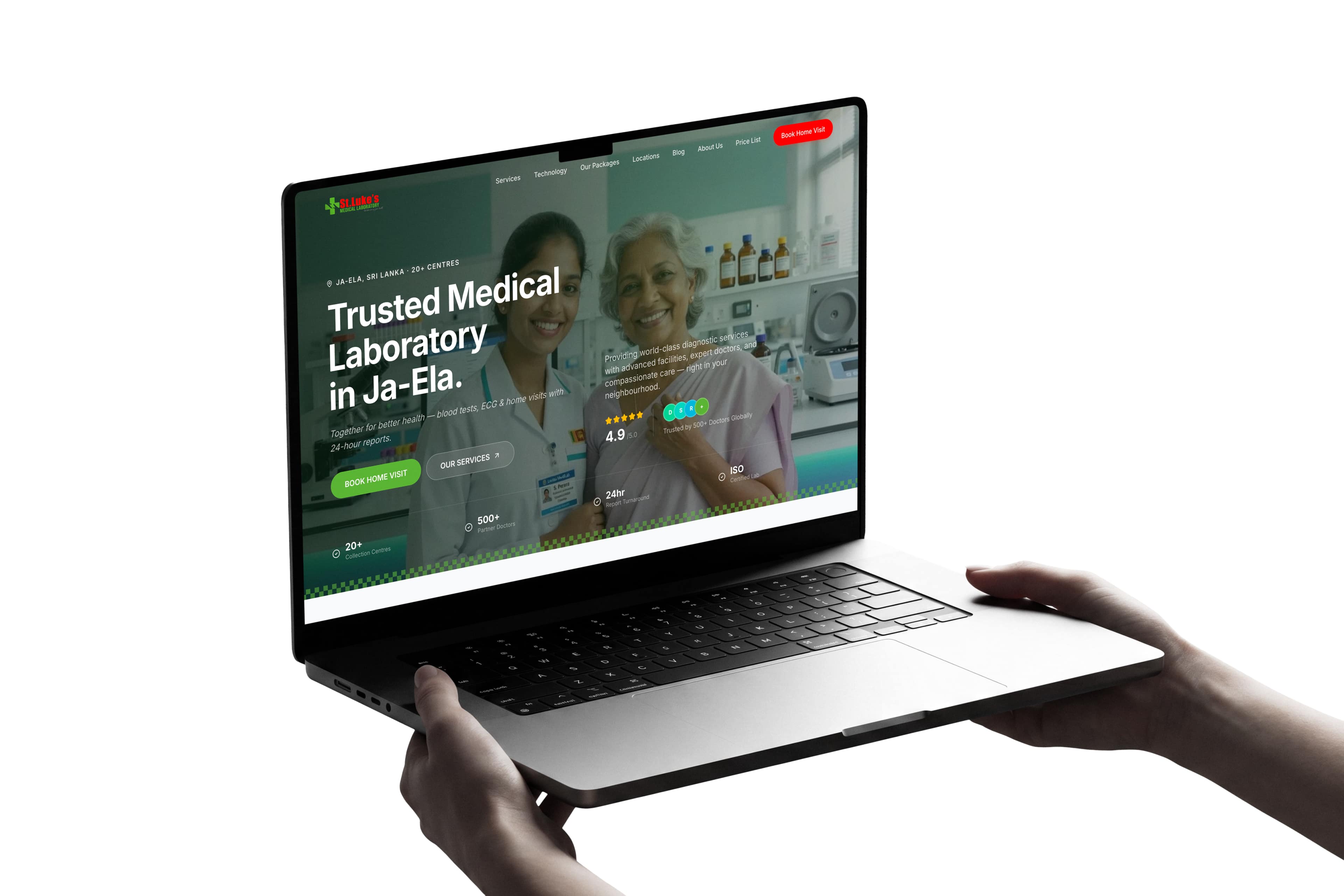
A trusted Ja-Ela medical lab serving 500+ partner doctors had no digital front door — patients and partners couldn't find services, pricing, or home-collection coverage online, and the lab was invisible on local search for high-intent queries like 'blood test Ja-Ela' or 'medical lab near me'.
01
No price list patients could find
Patients arrived at the door without knowing what a test would cost — friction at the moment of decision.
02
No credible link doctors could share
Partner doctors had nothing to send to referrals. The lab was a phone number, not a brand.
03
Home-collection coverage was a guess
Families in Kandana, Welisara, Ragama and Wattala didn't know if a phlebotomist would actually come.
02/The Solution
We rebuilt the site from the ground up: a calm, clinical-grade UI that surfaces 24-hour reports, ISO certification and equipment specs above the fold; service-led information architecture organised around how patients actually search; a home-collection flow that maps to real service areas (Ja-Ela, Kandana, Welisara, Ragama, Wattala); and a local-SEO foundation tuned for medical search.
Architected Deliverables
Brand-aligned site architecture across 20+ pages
Service detail pages for each test category
Health package pricing module
Local SEO with structured data (LocalBusiness, MedicalClinic)
Home collection booking flow
03/The Outcome
A site that converts trust into bookings — the lab's first ranked organic presence on Colombo-area medical search, a frictionless path from 'I need a test' to 'I've booked one', and a foundation the team can extend into corporate health screening and partner doctor programmes.
Digital Platform
Engineered for conversion, built for scale.
Every viewport structured around user intent — responsive navigation, clear informational hierarchy, and high-performance frontend engineering.
www.stlukesmedilab.com
SSL ✓
Services — test-category architecture02
Packages — transparent pricing module03
Home collection — booking flow04
Design Rationale
Every pixel had a reason.
Healthcare design lives or dies on credibility. Two failure modes dominate: cold corporate sterility that signals 'machine' instead of 'care', and friendly amateur warmth that signals 'unqualified'. We aimed for a third register — clinical-grade, but human — by anchoring every visual decision in either trust (the lab is competent) or care (the patient is seen). Nothing on the site is decorative.
Visual PreviewPoint 01 / 04
Healthcare design fails two ways. We aimed for a third.
Color Token Architecture
7 Documented Swatches · Tap to Copy
Typography Hierarchy
Typeface Pairings
display
Inter
500 / 600
Trusted Medical Laboratory in Ja-Ela
Inter's neutral geometry reads as clinical and modern without feeling cold. Medium and semibold weights carry hierarchy without screaming.
body
Inter
400 / 500
World-class diagnostic services, delivered with the care your family deserves.
Same family across display and body — fewer mental gear-shifts for the reader. Optimised for screen at 16–18px.
mono
JetBrains Mono
500
REPORT · 24H · CODE: CBC-001
Reserved for codes, IDs, lab references, and trust badges — small caps with letter-spacing for a 'medical chart' feel.
Motion & Choreography
Interaction Standards
01
Restraint over flair
Healthcare audiences read 'busy motion' as 'unprofessional'. Animations are limited to 300–600ms ease-out reveals on scroll, gentle hover lifts on cards, and the page transitions. Nothing oscillates or auto-plays.
02
Purpose only
Motion exists to either guide attention (the booking CTA pulse) or confirm a state (form success, copy-to-clipboard for the phone number). Decorative motion was cut in review.
03
Respect reduced-motion
`prefers-reduced-motion: reduce` is honoured everywhere — animations either disable or collapse to opacity-only transitions. Tested in Safari, Chrome, and on iOS.
The brief
World-class diagnostics, invisible online.
St Luke's has run ISO-certified equipment, partnered with 500+ doctors and turned reports around in 24 hours for years. The science was world-class. The website didn't say so.
01
No price list patients could find
Patients arrived at the door without knowing what a test would cost — friction at the moment of decision.
02
No credible link doctors could share
Partner doctors had nothing to send to referrals. The lab was a phone number, not a brand.
03
Home-collection coverage was a guess
Families in Kandana, Welisara, Ragama and Wattala didn't know if a phlebotomist would actually come.
The cost
And on Google, the lab was invisible for the exact queries its patients were typing — 'blood test near me', 'lipid profile Ja-Ela', 'home blood collection Wattala'. We were brought in to fix all three: design, build, and rankings.
The approach
Healthcare design fails two ways. We aimed for a third.
“Clinical-grade, but human.”
Equipment, not adjectives
The hero doesn't say 'world-class diagnostics' as a tagline. It shows the equipment, names it, links the spec sheet.
Rating beside reality
The 4.9/5 rating sits next to the 500+ doctors who actually refer — credibility earned by being specific.
Promise built into the flow
The 24-hour report turnaround isn't a banner — it's how the booking flow is structured, end to end.
Information architecture
One page per real patient query.
We mapped every page to a search a real person was already typing — not the way the lab files its services internally.
Tap or hover a card to see the query it ranks for
Local SEO foundation
The technical layer matters more than the words.
Four moves did most of the heavy lifting on the ranking side.
01
Structured data for LocalBusiness + MedicalClinic
Google reads these to populate the Maps pack and Knowledge Panel — the surface most local patients see first.
02
Registered properly across mapping services
Consistent name, address and phone across Google Business Profile, Bing Places and Apple Maps — the unsexy plumbing that makes everything else work.
03
Meta + titles tuned for local intent
Every page title carries the suburb or the symptom. No generic 'Welcome to St Luke's' titles wasted on high-traffic queries.
04
Blog seeded with named clinician bylines
Author boxes link to credentials — the way Google's E-E-A-T criteria reward expertise, authoritativeness and trust on YMYL content.
What changed
A digital business card became an acquisition channel.
Organic
Bookings now arrive directly
Real patients finding the lab via the queries we built for — not a phone-only funnel anymore.
Shared
Partner doctors send the link
A credible site that adds to a referring doctor's reputation rather than subtracting from it.
Extensible
Foundation, not a finish line
Corporate screening, partner portal, online report delivery — all live on the same architecture without a rebuild.
Healthcare SEO is a long game. We're still optimising suburb pages, expanding the blog and watching rankings move on the high-intent queries. This is what a project looks like when design, engineering and SEO are treated as one discipline rather than three handoffs.
Delivery Framework
From brief to release: how we build.
A disciplined, transparent production process ensuring zero ambiguity and measurable return on investment at every milestone.
Stage 01 Focus
Discover Phase
Deep-dive alignment workshops to audit existing analytics, interview key stakeholders, and define quantifiable criteria for project success.
Phase Deliverables
Stakeholder interviews
Competitive gap analysis
Technical audit
Success metrics roadmap
01/Phase
Discover
Deep-dive alignment workshops to audit existing analytics, interview key stakeholders, and define quantifiable criteria for project success.
Key Outputs
Stakeholder interviews
Competitive gap analysis
Technical audit
Success metrics roadmap
02/Phase
Define
Synthesizing customer mental models into information architecture, taxonomy, content blueprints, and high-intent query maps.
Key Outputs
Information architecture
Customer journey mapping
Content strategy blueprint
Search-intent taxonomy
03/Phase
Design
Architecting the visual direction — typography hierarchy, spatial systems, interactive states, and design tokens across every viewport.
Key Outputs
Design token architecture
Interactive UI prototypes
Responsive wireframes
Design guidelines manual
04/Phase
Build
Engineering clean, performant frontend code with React, Next.js, and TypeScript, backed by semantic SEO schemas and accessibility standards.
Curated perspectives of the final digital product, interfaces, and collateral across responsive viewports.
AEO & Questions
Questions about this engagement
Where is St Luke's Medical Laboratory located?
St Luke's Medical Laboratory is based in Ja-Ela, Sri Lanka, and serves the surrounding suburbs of Kandana, Welisara, Ragama and Wattala through 20+ collection centres.
Does St Luke's offer home blood collection?
Yes. St Luke's runs home blood collection across Ja-Ela, Kandana, Welisara, Ragama and Wattala. A phlebotomist visits the patient's home and reports are turned around within 24 hours.
How fast does St Luke's deliver test reports?
Standard turnaround is 24 hours for the majority of tests, including CBC, lipid profile, biochemistry and urine analysis. Some specialised panels may take longer and are flagged at booking.
Is St Luke's Medical Laboratory ISO certified?
Yes. St Luke's runs ISO-certified equipment and is referenced by 500+ partner doctors across the Colombo region. Certification details and equipment specs are surfaced on the site for transparency.
What health packages does St Luke's offer?
St Luke's offers transparent, symptom-led health packages — including diabetes, heart, women's wellness and full-body screening — with no hidden charges. Pricing is published openly on the packages page.
Who designed and built the St Luke's website?
Uniix Studio designed, built and ranks the St Luke's Medical Laboratory website end-to-end — including brand-aligned UI, the booking and home-collection flow, structured data for LocalBusiness and MedicalClinic, and the local-SEO programme.